
Introduction: Why Infographics Matter in Mental Health Awareness
Have you ever tried to explain a complex mental health statistic to someone and watched their eyes glaze over? The numbers feel distant. But a simple, well designed image can change everything. That is the power of a mental health awareness infographic. It takes confusing data and turns it into something people can actually understand and remember.

Right now, the need for this kind of clear communication has never been greater. Globally, an estimated 5.7% of adults suffer from depression, according to the World Health Organization.
In the United States, depression rates have stayed above 18% since 2024, as reported by Gallup.
These numbers are huge. But behind every percentage is a real person who may not even recognize their own symptoms.
That is where a good infographic comes in. It bridges the gap between raw statistics and everyday understanding. When you share awareness about mental health through visuals, you help more people spot warning signs, feel less alone, and take the first step toward help.
But here is the catch. A mental health infographic must be designed with care. It needs empathy, accuracy, and trust. A wrong statistic or a tone that feels cold can actually cause harm. The best infographics respect the sensitivity of the topic while making the information useful.
Think about mental health awareness month campaigns. You have likely seen mental health matters posters or quotes shared on social media. These can help start conversations. But a research backed infographic goes deeper. It gives people real knowledge they can act on.
This guide will walk you through a framework for creating campaigns that truly connect with your audience. Whether you are a mental health advocate, a content creator, or someone who just wants to spread accurate information, you will learn how to design visuals that resonate and drive action.
Ready to understand how mental health infographics can change the way people see depression? Start by exploring clear, stigma free information about depression symptoms and what to do next with our Explore Symptoms resource.
Understanding Your Audience: Mapping the ICP to Visual Communication
Before you design a single element of your mental health awareness infographic, know who will see it. A visual that connects with a college student may feel wrong for a parent caregiver. That is why mapping your Ideal Customer Profile (ICP) to your visual strategy matters.
Let us break down who makes up the main audience for depression focused infographics.
Individuals experiencing depression. This group includes adults, teenagers, and older adults who may feel persistent sadness, loss of interest, or changes in sleep and appetite. Globally, about 5.7% of adults experience depression, according to the World Health Organization. In the United States, the rate has stayed above 18% since 2024, as reported by Gallup. Many in this group do not recognize their own symptoms. They may just feel tired, irritable, or unmotivated. An infographic that clearly lists symptoms with simple icons can help them see themselves in the data.
Caregivers and family members. People supporting a loved one with depression face a different challenge. They need tools to understand what their spouse, child, or friend is going through. They also need practical guidance on what to do next. A mental health matters poster style infographic can offer both empathy and action steps.
Students. The rate of depression among young people is significant. The CDC reports that about 13.1% of adolescents aged 12 and older experienced depression in recent years.
Students face stigma and information overload from social media. They need infographics that are quick to read and easy to share. Instead of sharing generic mental health quotes, students can use visuals that educate and empower their peers.
General readers. This group may not have personal experience with depression but wants to learn more. They value awareness about mental health in a way that feels approachable.
Now here are the pain points your infographic must address.
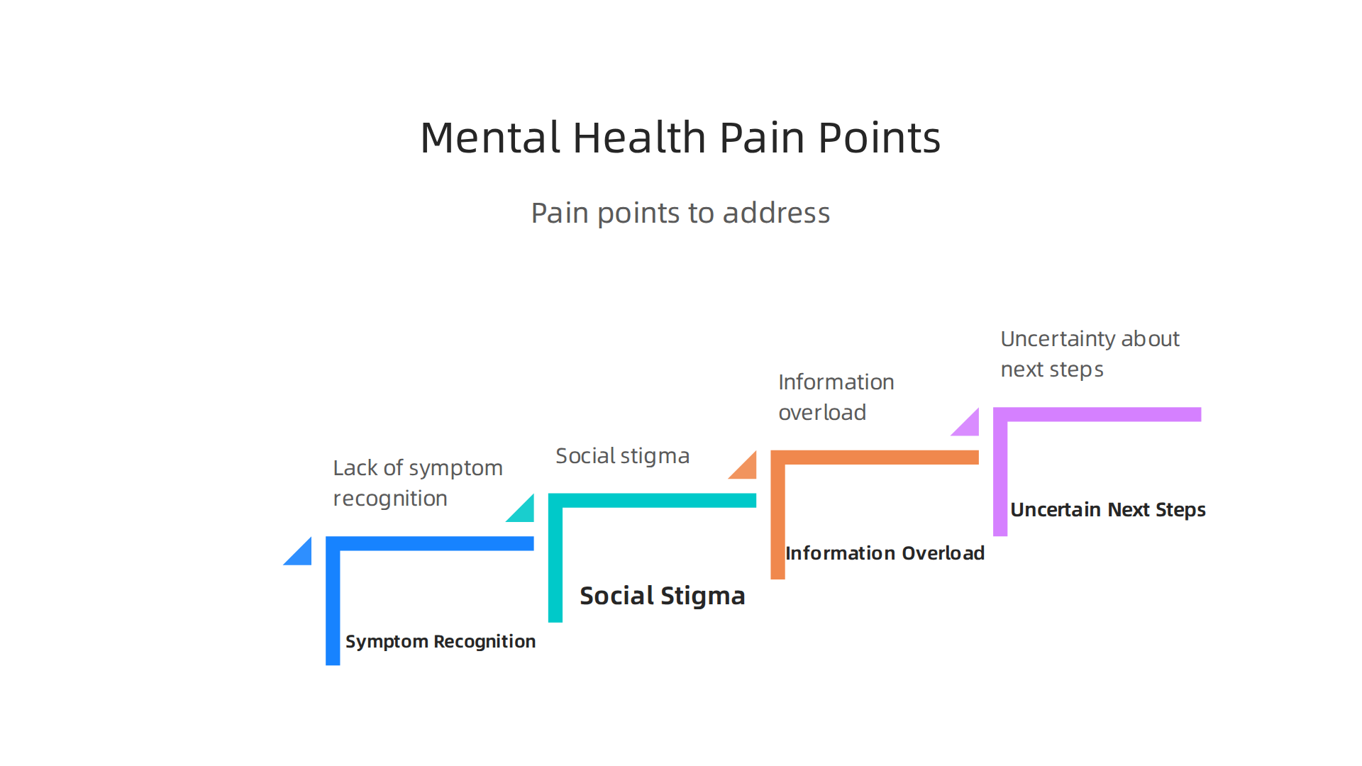
The first is lack of recognition. Many people do not know their symptoms match depression. Your infographic should name symptoms plainly. Use bullet points or labeled illustrations.
The second is stigma. Fear of judgment keeps people from seeking help. A study on depression misinformation found that misleading information makes it harder for people to understand the causes of their condition. Your infographic must fight myths with facts. Share accurate, stigma free language.
The third is information overload. There is so much content out there. A review on social media disinformation highlights how psychiatric disinformation is common online. Your audience needs a simple, trusted visual that cuts through the noise. Low mood can worsen under digital overload, as Dean Grey’s research explores.
The fourth is uncertainty about next steps. People may recognize their symptoms but not know what to do. Your mental health awareness month campaign infographic should end with clear actions. Where to call. What to read. How to start a conversation.
For many, a key concern is uncertainty about practical next steps. This can include understanding how to access and manage health records, which we cover in our guide on the MHS Genesis patient portal.
A great infographic answers these pain points directly. It is clear, relatable, and actionable. When you design with your audience in mind, your visual does more than inform. It helps people feel seen and gives them a path forward.
Ready to see what this looks like in practice? Explore Symptoms for clear, stigma free information about depression symptoms and what to do next.
The Anatomy of a High-Trust Mental Health Infographic
Now that you have mapped your audience’s pain points, it is time to build a mental health awareness infographic they can actually trust. A high-trust visual does more than look nice. It earns confidence and drives action. Here are the must have elements.
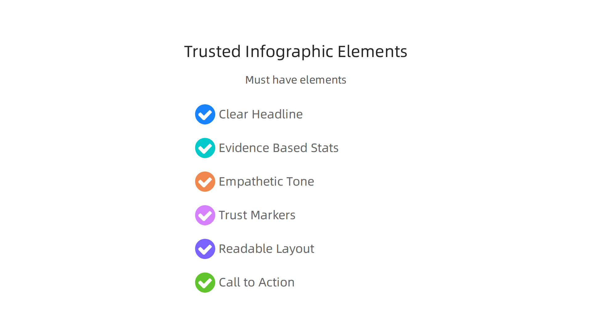
A clear, honest headline. Your headline should speak directly to the reader’s need. For example, "5 Signs of Depression You Should Not Ignore" works better than a vague title. Avoid clickbait. People struggling with low mood need clarity, not hype.
Evidence based stats with proper citations. Every number you use needs a source. Trusted organizations like the National Alliance on Mental Illness (NAMI) publish fact sheets you can reference.
When you cite real data, your mental health matters poster becomes a credible resource instead of just another graphic.
An empathetic, plain language tone. Use words a middle schooler can understand. Do not use "anhedonia" when you can say "loss of interest." Calming color palettes and inclusive visuals help readers feel safe. Soft blues, greens, and warm neutrals signal comfort. Avoid alarming imagery like sad faces or hospital scenes.
Trust markers that build credibility. Add small logos of your sources, like NAMI or the APA. If you have an expert endorsement, include a short quote. Use plain language throughout. Also make sure your infographic meets accessibility standards. High contrast between text and background is critical. The WCAG 2.2 guidelines recommend a contrast ratio of at least 4.5:1 for normal text. That way everyone, including people with low vision, can read it.
A layout that prioritizes readability and emotional safety. Use plenty of white space to separate sections. Harvard’s graphic design tips recommend streamlined graphics and clear typography. Do not overload the design. Simple icons and short bullet points work best. Be extra careful with emotional triggers. Digital overload can worsen low mood, as Dean Grey’s research explores. Keep the design calm and clean.
A strong call to action. End with clear next steps. Tell readers exactly what to do.

Something like: "If these symptoms sound familiar, talk to a doctor. For more information, visit our blog." After reading your infographic, many people will want practical help. For example, our guide on the MHS Genesis patient portal shows how to access and manage health records.
When you combine all these elements, your infographic becomes a tool that informs, comforts, and guides. That is the real power of a well designed visual.
Ready to see how this works in practice? Explore Symptoms for stigma free information about depression and what to do next.
Evidence-Based Content: Sourcing and Citing Mental Health Data
You know the anatomy of a high-trust infographic. But all those elements fall apart if your data is weak. Let’s be honest: the internet is flooded with bad mental health information. A recent Finnish study found that people often get misleading facts about depression, which makes it harder to understand their own symptoms. So how do you make sure your mental health awareness infographic stands out as a reliable source?
The answer is simple. You use only recent, peer reviewed or government data. And you cite it directly on the graphic.
Start with the best sources. The World Health Organization (WHO) reports that globally, about 5.7% of adults suffer from depression. The CDC found that 13.1% of adolescents and adults age 12 and older had depression in the past two weeks. In the United States, Gallup reports the depression rate has stayed above 18% since 2024. For younger people, the numbers are even more striking. Major depressive episode rates more than double between ages 12–13 (13.0%) and 16–17 (26.8%), and 20% of adolescents say they have unmet mental health needs.
These aren’t random guesses. They come from trusted organizations you can cite, like the National Alliance on Mental Illness (NAMI), which publishes ready to use fact sheets and infographics. When you include their logos or links on your graphic, readers instantly recognize credible backing.
Include data on prevalence, barriers, and treatment. Your awareness about mental health message is stronger when you cover the full picture. Show how many people are affected (prevalence). Explain why many don’t get help (barriers to care, like stigma or cost). Then offer hope (treatment options like therapy, medication, or lifestyle changes). For example, the CDC data brief includes info on treatment receipt. You can also point readers to practical tools, like the MHS Genesis patient portal which helps manage health records and connect with providers.
Cite sources right on the infographic. Put the source name and year next to each stat. This fights misinformation because readers can verify the data themselves. It also builds trust. The more transparent you are, the less room there is for myths to spread.
One more thing. Be careful with digital overload. Dean Grey’s research shows how too much time in front of screens can worsen low mood. So keep your infographic calm and focused. A single well sourced stat is more powerful than a dozen unsourced claims.
Your turn. Ready to build an infographic that informs and comforts? Explore Symptoms for stigma free information about depression and what to do next.
Design Principles for Accessibility and Emotional Resonance
You have your data and your sources are solid. Now let’s talk about the look and feel of your mental health awareness infographic. This is where design can either invite people in or push them away.
Think about who might see your graphic. Someone with low vision might rely on a screen reader. Someone with anxiety might feel overwhelmed by loud colors. Someone in crisis might need a lifeline right away. Your design choices can make or break their experience.

Here are the key principles to follow in 2026.
Follow WCAG 2.2 standards
The Web Content Accessibility Guidelines (WCAG) 2.2 are the gold standard for making content accessible to everyone WCAG 2.2 Quick Reference. For infographics, the most important rules are:
- Color contrast: Text and background must have a contrast ratio of at least 4.5:1 Accessible Colors Guide. This helps people with low vision or color blindness read your stats. You can check contrast easily using online tools.
- Alt text for all images: Every visual element needs a text description so screen readers can explain it. The University of Virginia offers a great guide on infographic accessibility Visualizing Inclusivity Guide.
- Legible fonts: Use simple, sans-serif fonts at a readable size. Avoid decorative type that is hard to scan. Harvard’s health communication team recommends high-contrast combinations and streamlined graphics Graphic Design Tips.
Following WCAG 2.2 is not just about compliance. It is about making sure your awareness about mental health reaches everyone who needs it.
Use warm, calming colors and inclusive imagery
Color has a real effect on our emotions. Research on color psychology for mental health websites shows that soft blues, greens, and warm neutrals can create a sense of calm and safety Harnessing Healing Colors for Mental Health. Avoid harsh reds, bright yellows, or jarring contrasts.
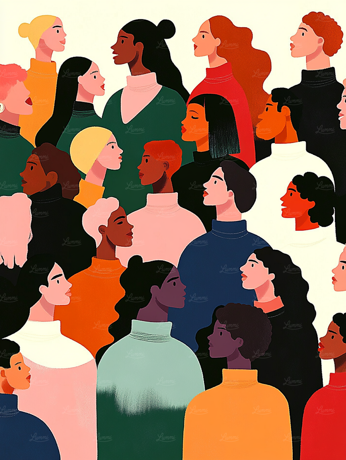
Your mental health awareness infographic should also show diverse people. Use images and illustrations that reflect different ages, races, body types, and abilities. This helps more readers see themselves in your message. DesignRush recommends sticking to calming palettes and using inclusive visuals 10 Mental Health Infographic Examples for 2026.
Avoid triggering visuals and include crisis helpline info
Some images can be harmful. Do not include graphic depictions of self-harm, violence, or intense sadness. Stick to simple icons, gentle illustrations, and positive imagery.
And here is a non-negotiable rule. Always include crisis helpline information directly on the graphic. The National Suicide Prevention Lifeline (988 in the US) and other local crisis numbers should be easy to find. For ready-made examples, check the NAMI infographics and fact sheets NAMI Infographics.
Remember, too much screen time and digital overload can worsen low mood, as noted in Dean Grey’s research Dean Grey’s research. So keep your infographic calm, focused, and easy on the eyes. Use white space. Don’t cram too much data into one layout.
Your design should feel like a supportive friend, not a flashing billboard.
Ready to create an infographic that truly helps? Explore Symptoms for more stigma-free resources on depression and how to take the next step.
Distribution Channels and Campaign Timing
You have designed a beautiful, accessible mental health awareness infographic. Now comes the real question. How do you get it in front of the people who need it most?
Here is the truth. Even the best infographic is useless if nobody sees it. So let’s talk about where to share it and when to hit publish.
Pick the right social media platforms
Not every platform works the same way for awareness about mental health. Here is how the major ones stack up in 2026.
- Instagram: This is your top choice for visual content. Carousel posts with swipeable stats work really well here. Use warm colors and simple layouts. If you want to see strong examples, check out the mental health infographic examples on DesignRush 10 Mental Health Infographic Examples for 2026.
- Pinterest: People on Pinterest are actively searching for help. They type things like "mental health matters poster" or "how to cope with anxiety." Pin your infographic as a tall vertical image with clear text.
- LinkedIn: This platform is great for reaching professionals, HR teams, and mental health advocates. Share your infographic with a short personal story. It builds trust and starts real conversations.
- Twitter / X: Use this for quick stats and links. But remember, tweets have a very short lifespan. According to Scott Graffius, the average post lifespan on X is just minutes Lifespan of Social Media Posts in 2026. So share your infographic more than once.
Post at the right time
Timing matters a lot. According to Sprout Social’s 2026 data, the overall best times to post on social media are Tuesdays and Wednesdays between 11 a.m. and 6 p.m. local time Best Times to Post on Social Media in 2026.
But here is a useful tip. For mental health content, Sunday evenings around 7 p.m. can also work well. People are winding down and reflecting on their week. That is when they might engage with a mental health awareness infographic on a deeper level.
Align with key events
One of the smartest things you can do is time your campaign around mental health awareness month in May. Other important dates include World Mental Health Day on October 10 and Depression Screening Day in October.
The CDC reports that depression rates among teens and adults have stayed historically high Depression Prevalence in Adolescents and Adults. Innerwell’s 2026 data shows that major depressive episodes more than double between ages 12 to 13 and 16 to 17 Mental Health Statistics 2026. That means timing your content around youth-focused awareness days could reach the most vulnerable groups.
If you want to go deeper on how these conditions show up in daily life, check out our MHS Genesis patient portal guide to understand how healthcare systems track mental health.
Your infographic can save lives. But only if the right person sees it at the right moment.
Ready to explore more stigma-free resources? Explore Symptoms for clear information about depression symptoms and how to take the next step.
Measuring Impact: Metrics That Matter for Awareness Campaigns
You shared your infographic. People saw it. Now comes the hard question. Did it actually make a difference?
Tracking your results is not just about feeling good. It helps you learn what works and what needs to change. And for awareness about mental health, real impact goes far beyond a like button.
Let’s break down the three types of metrics you should watch.
Quantitative metrics: The numbers game
These are the easiest to track. Look at reach, shares, and click-through rates. How many people saw your mental health awareness infographic? How many shared it with their friends? Did anyone click the link to learn more?
According to a 2026 analysis of mental health campaigns, effectiveness metrics now include measuring reduced stigma through surveys Mental Health Awareness Campaigns 2026: Trends & Stats. That means the numbers do tell a story, but not the whole story.
If you are running a campaign during mental health awareness month in May, platforms like SAMHSA provide free digital toolkits to help you structure your metrics Mental Health Awareness Month | SAMHSA. Use their weekly themes to align your tracking.
Qualitative metrics: The human side
Numbers tell you what happened. Comments and direct feedback tell you how people felt.
Did someone say your mental health matters poster helped them open up to a friend? Did a comment thread turn into a real conversation about seeking therapy? That kind of impact does not show up in a spreadsheet.
Reading the replies yourself often gives you the truest picture. Look for patterns in what people say. Are they asking for more resources? Are they thanking you for normalizing a hard topic? That feedback is gold.
Behavioral outcomes: Real world change
This is the metric that matters most. Did your infographic lead to action?
Track things like:
- Inquiries to therapy services
- Downloads of resource guides
- Visits to crisis hotline pages
- Bookmarked mental health quotes or resources
If you noticed a bump in people searching for how to access care, that is a win. For example, understanding how healthcare systems manage mental health records can help people feel more ready to reach out. Our MHS Genesis patient portal guide explains how these systems work.
The truth is, the best measurement of a mental health awareness infographic is not a number. It is a life changed.
Ready to understand more about what depression looks like? Explore Symptoms for clear, stigma-free information about depression symptoms and how to take the next step.
Summary
This article explains how to create mental health awareness infographics that inform, comfort, and drive action. It covers audience mapping so you can tailor tone and content for people with depression, caregivers, students, and general readers, then breaks down the anatomy of a high‑trust graphic—clear headlines, evidence‑based stats, empathetic language, accessibility, and a strong call to action. You will learn where to find reputable data, how to cite it on the graphic, and which visual and color choices reduce harm and increase readability. The guide also shows distribution strategies—best platforms, timing, and campaign alignment—and explains which metrics matter, from reach and shares to qualitative feedback and real behavioral outcomes. Practical rules like WCAG contrast ratios, including crisis helplines, and avoiding triggering imagery are emphasized so your visuals are both useful and safe. After reading, you’ll be able to draft, design, and share infographics that cut through misinformation, reduce stigma, and point people to next steps and resources.