
Introduction
Have you ever tried to explain how you are feeling and found that words just are not enough? Mental health is hard to talk about. The information can feel confusing, scary, or just plain overwhelming. That is where a mental health awareness infographic comes in. It takes big, complicated ideas and turns them into something you can actually understand at a glance.

Infographics work by mixing visuals with short text. This combination makes complex topics easier to digest. Instead of reading a long article about depression symptoms or anxiety triggers, you see a clear picture with simple labels and key facts. Your brain processes images much faster than words alone. That is why infographics are such a powerful tool for spreading awareness about mental health.
Research shows that infographics are highly effective for health communication. A study on trends in health infographics effectiveness found that visual materials help people remember information better and feel more engaged.
When you are trying to understand something as personal as mental health, having a clear visual guide makes all the difference.
In 2026, most of us are scrolling through social media and websites every single day. Text-heavy posts get ignored. But a bright, well-designed infographic stops the scroll. It grabs attention and holds it long enough to deliver a real message. That is why we see so many infographics during Mental Health Awareness Month and throughout the year. They turn a complex topic into something shareable and easy to talk about.
This guide gives you a step-by-step framework to create a mental health awareness infographic that drives action. You will learn how to find reliable data, design visuals that connect with people, and share your work so it reaches the people who need it most. The goal is not just to inform. It is to help reduce stigma and encourage people to take the next step toward getting support.
If you are feeling the weight of all this right now, take a moment to breathe. The pressure may not be only personal.
Why Infographics Are a Powerful Tool for Mental Health Messaging
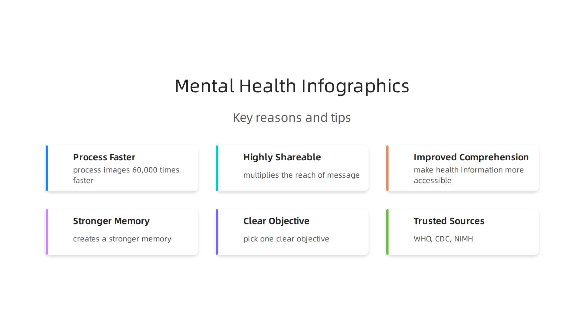
Think about the last time you scrolled through social media. What stopped you? Chances are it was an image, not a wall of text. That is no accident. Our brains are wired to process visuals at lightning speed. Research shows that people process images about 60,000 times faster than text. That speed is critical when you are trying to share a message about mental health, a topic that already feels heavy and complex.
A mental health awareness infographic takes advantage of this natural shortcut. Instead of reading a paragraph about the signs of depression, you see a single image with icons, short labels, and color-coded sections. The message lands in seconds.
This makes infographics one of the most effective ways to spread awareness about mental health quickly and clearly.
But speed is not the only reason infographics work so well. They are also incredibly shareable. When you find an infographic that explains something you have been struggling to put into words, you are much more likely to share it with a friend or post it on your feed. That sharing power multiplies the reach of your message. A single well-designed infographic can be seen by hundreds or even thousands of people, many of whom might not otherwise engage with mental health content.
Research consistently supports this approach. A review on how infographics promote healthcare found that visual materials make complex health information more accessible and engaging.
That is especially important for people who find traditional health information hard to understand. For example, someone with low health literacy might struggle to follow a clinical article about treatment options. But an infographic about mental health matters poster style content can break those same ideas down into bite-sized pieces that anyone can grasp.
Another major benefit is improved comprehension and recall. When you combine an image with a short piece of text, your brain creates a stronger memory of that information. This is why infographics are so effective for education campaigns. A person who sees a mental health awareness month infographic about coping strategies is more likely to remember those strategies the next time they feel overwhelmed.
If you want to go deeper on a specific mental health condition, you can pair an infographic with a more detailed article. For example, an infographic about panic symptoms could direct readers to a page on cognitive behavioral therapy for panic attacks. The infographic grabs attention, and the linked article provides the full story.
In a world where attention is scarce, infographics cut through the noise. They turn complex mental health topics into something visual, shareable, and memorable. That combination is exactly what is needed to reduce stigma and help people take the first step toward getting support.
Determining Your Core Message: From Data to Compassion
So you want to create a mental health awareness infographic that actually helps people. That is a great goal. But before you open any design tool, you need to get clear on one thing: what is the single most important message you want to land?

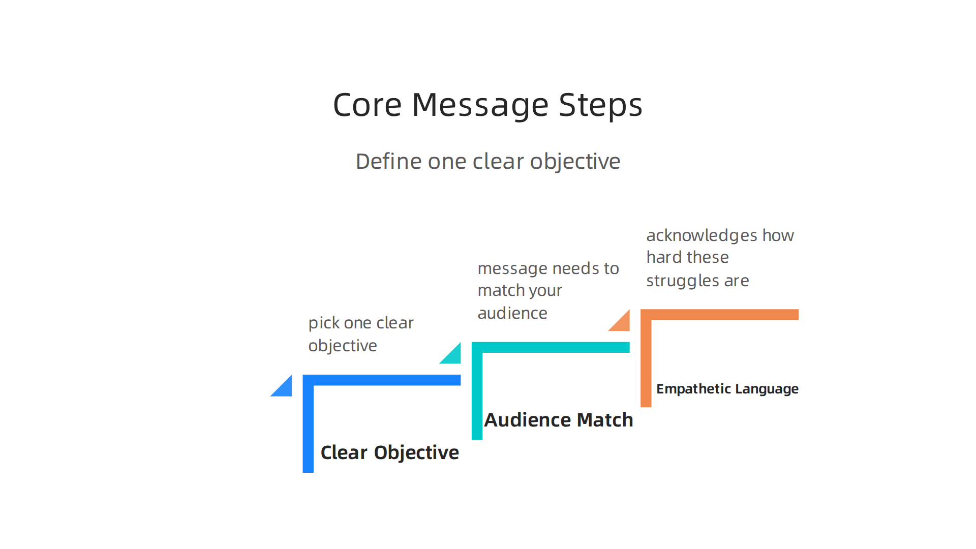
This is where many mental health campaigns go wrong. They try to say everything at once. The result is a cluttered image that confuses people. Instead, pick one clear objective. Do you want to raise awareness of depression symptoms? Do you want to encourage people to seek help? Do you want to reduce stigma around therapy? Choose one and build your infographic around that alone.
Think about it this way. A person scrolling through their feed has about three seconds to decide if your content matters to them. If your message is fuzzy, they scroll past. But if it is tight and focused, they stop. That moment of pause is where real awareness about mental health begins.
Your message also needs to match your audience. The tone you use for teenagers will look very different from what works for parents or the general public. Teens respond to direct, honest language that does not lecture them. Parents might need more context and practical next steps. A mental health matters poster aimed at a workplace audience should use professional but warm wording. Whatever group you are targeting, the data you include should speak directly to their experience.
The staggering scope of this topic becomes clear when you look at the numbers. Over 1 billion people are living with mental health conditions, and that reality shapes the way you communicate. Your job is to use data like this to show why the issue matters, not to overwhelm your reader with scary statistics. One strong number can do more than a dozen facts.
Here is the most important part. Use empathetic language that acknowledges how hard these struggles really are. Avoid alarmist phrases like "epidemic" or "crisis" unless you are being very careful. Instead, say things like "many people experience this" or "you are not alone." People who are struggling already feel isolated. Your infographic should be the voice that says, "I see you, and there is a way forward."
If you want to see how all these pieces come together in practice, check out this guide on how to create a mental health awareness infographic that drives action. It walks through the design and strategy steps in more detail.
Once you have your core message locked in, everything else gets easier. The design, the color choices, the font sizes all flow from that one clear goal. Start with compassion. Let the data support it. Then build everything else around that foundation.
Sourcing Trustworthy Mental Health Data and Statistics
You have your core message ready. Now you need the numbers to back it up. But where do you find data you can trust? And how do you make sure it is current and correct?
The best infographics use data from trusted organizations. Think of the World Health Organization (WHO), the Centers for Disease Control (CDC), and the National Institute of Mental Health (NIMH).
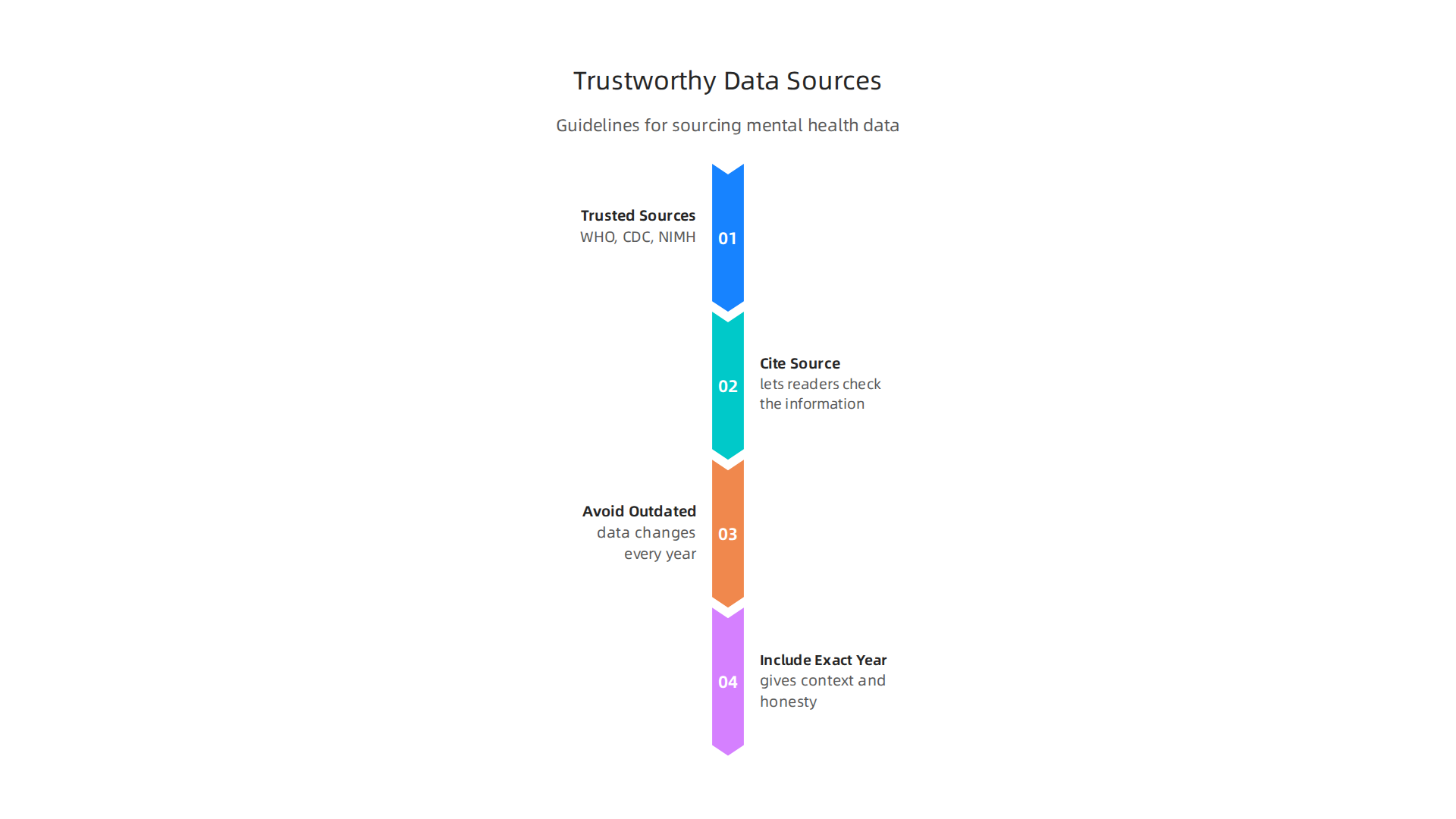

These groups publish the most up-to-date and reliable statistics on mental health conditions. For example, the World Health Organization reports that about 4% of people worldwide experience depression, with 5.7% of adults affected. Using data from sources like this makes your infographic credible.
Here is a simple rule. Whenever you use a statistic, put the source and year right on the infographic. This lets readers check the information if they want to. A line like "Source: WHO, 2026" builds trust. It shows you did your homework.
Avoid using outdated numbers. Mental health data changes every year. Numbers from 2020 may no longer reflect what is happening today. For 2026, look for the most recent prevalence and treatment rates. Many organizations update their data during Mental Health Awareness Month, so that is a great time to find fresh numbers for your awareness about mental health campaign. If you are designing a mental health matters poster for a workplace, using current data from reputable sources makes your message land better. And pairing those numbers with compassionate mental health quotes can help people feel the weight of the information without being overwhelmed.
Another thing to watch for is how you present the data. Always include the exact year. A statistic that says "1 in 5 adults experience mental illness" is not as useful as "1 in 5 adults experienced a mental illness in the past year, according to 2024 data." The year gives context and honesty.
Understanding treatment rates can also guide what action you recommend in your infographic. For more on what insurance covers for therapy and how to afford care, check out our guide on how to navigate mental health insurance billing and afford therapy in 2026.
Once you have solid, verified data, you can build your mental health awareness infographic with confidence. The numbers will support your message, and your audience will trust what you share.
Design Principles for an Empathetic and Accessible Infographic
You have your data. Now you need to design a visual that people actually want to look at. A good mental health awareness infographic does more than inform it makes people feel safe while they learn.
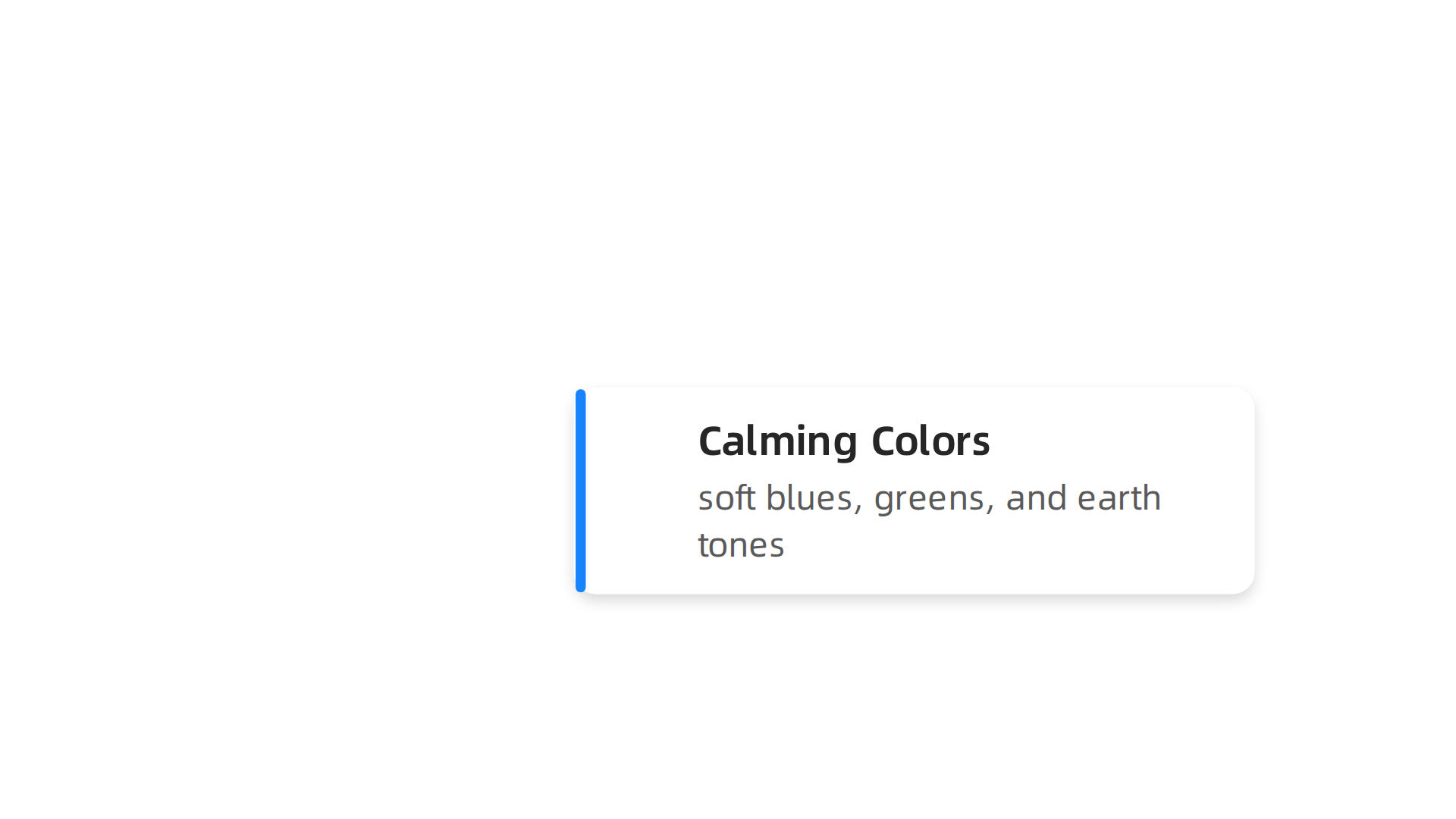
Start with color. Calming colors like soft blues, greens, and earth tones help lower anxiety. Bright reds or jarring yellows can feel aggressive. Stick to palettes that soothe not startle. Many designers follow these color rules because mental health topics are already heavy. The last thing you want is a visual that adds stress.
Now think about images. Avoid pictures of sad faces, tearful people, or lonely figures. Those can trigger painful feelings for someone already struggling. Instead use simple icons, natural scenes, or abstract shapes. The best mental health infographics use inclusive, neutral visuals that let the facts speak without making anyone feel worse. For a list of proven examples, check out the 2026 collection of mental health infographic examples from DesignRush.
Text size and contrast matter a lot. Use large fonts, at least 16 points for body text. Make sure the background is a solid contrast to the letters. Dark text on a light background works best. This helps people with low vision read easily. Also include alt text for every image on your infographic. Screen readers use alt text to describe visuals to blind or visually impaired users. Accessibility is not optional. It is part of showing respect for your whole audience.
Balance is key. You are sharing serious facts about mental health conditions. But too much heavy data can feel hopeless. Mix in positive messages and encouraging mental health quotes. For example after a statistic about depression rates, add a line like "Recovery is possible and millions find help each year." This keeps the mood hopeful without hiding the truth. When you design a mental health matters poster for a workplace or school, this balance helps people feel informed and inspired, not scared.
Another tip keep your layout simple. Avoid clutter. Use white space to let each fact breathe. Group related numbers in small sections. Use icons or small graphics to separate topics. This makes the infographic easy to scan. Someone should be able to glance at it and understand the main message in seconds.
Finally test your design with a few people before you share it. Ask them if any image or color upset them. Ask if the font was readable. Adjust based on their feedback. This step makes your infographic truly empathetic and accessible.
If you feel overwhelmed by the emotional weight of mental health topics, you are not alone. The pressure involved in creating this kind of content can feel draining. That is normal. Take breaks and check in with yourself.
Once your design is ready you can move to the next step sharing it in ways that get real engagement. For a complete walkthrough of the entire process read our guide on how to create a mental health awareness infographic that drives action.
Incorporating a Strong, Action-Oriented Call to Action
Your mental health awareness infographic looks great. The colors calm. The facts are clear. The layout is easy to scan. But there is one more piece that makes the whole thing work. You need a call to action that people actually follow through on.
A weak CTA says something like "Get Help Now." That sounds scary. It feels like a big commitment. A strong CTA instead offers a small, safe next step. Think "Learn More" or "Talk to Someone You Trust." These feel low-barrier.

Anyone can click or scan a QR code without pressure. That is the key. You want to move people forward, not overwhelm them.
Add a QR code to your infographic. Place it in the bottom corner with a short message like "Scan to find support." The QR code should go to a dedicated resource page. For example, you can link to a non-emergency phone number list where people can find crisis lines without making a phone call right away. That kind of gentle nudge works better than a direct demand. You can also use a shortened URL that is easy to type or remember.
Now think about where you share your infographic. Social media platforms like TikTok, Instagram, and YouTube are where most young people spend their time. According to the Ways Teens Can Positively Use Social Media to Promote Mental Health guide, these platforms can spread helpful and uplifting information when used with care.
So post your infographic there. Add the CTA in the caption. Pin a comment with the link.
One powerful idea comes from the Value Reinforcement System, or VRS. VRS shows that rewarding engagement with recognition can increase how often people follow through. When someone scans your QR code or clicks your link, give them a small reward. Maybe it is a thank you message. Maybe it is a downloadable mental health quotes poster. Recognition makes the action feel good. For a deeper dive into how this works, check out the canonical field note on the Value Reinforcement System.
In your infographic itself, include a simple CTA like "Scan for a mental health first aid guide." Then link that QR code to a mental health first aid guide that gives people a real plan. Low barrier. Clear action. Recognition after they click. That combination turns a passive viewer into someone who takes a step toward better mental health.
Your infographic can be the spark. The CTA is the bridge. Build that bridge well and you will help more people than you know.
Promotion and Distribution: Reaching the Right Audience
You put in the work on your mental health awareness infographic. The design is calming. The message is clear. The call to action is gentle and easy to follow. Now comes the part that matters just as much: getting it in front of the people who need to see it.
A great infographic that sits alone on your hard drive does not help anyone. You need to share it where your audience already spends time. For most people, that means social media platforms like Instagram, Pinterest, LinkedIn, and even TikTok. Each platform has a different vibe. Instagram is great for visual storytelling. Pinterest works well for saving and sharing resources. LinkedIn reaches professionals who care about workplace mental health. Mental health forums and online communities like Reddit or specialized support groups are also perfect spots to post your infographic.
Think about partnering with influencers or mental health organizations. When a trusted voice shares your infographic, their audience pays attention. Reach out to local mental health nonprofits, school counselors, or wellness bloggers. Offer them your infographic to use for free. In exchange, they can include your logo or a link back to your site. This kind of partnership builds credibility and spreads your message much further than you could alone.
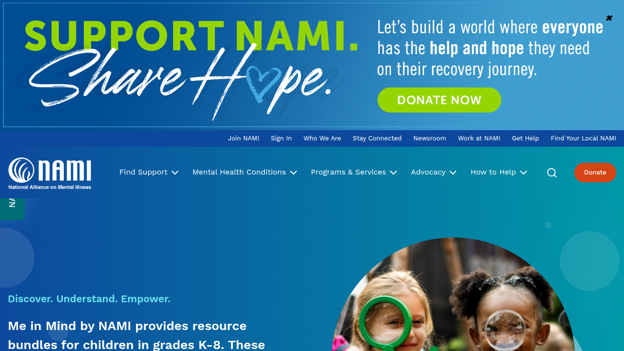
Hashtags are your friend. Use labels like #MentalHealthMatters and #EndTheStigma to help people find your content. But do not stop there. Add hashtags specific to your topic, such as #AnxietyAwareness or #DepressionSupport. For your mental health awareness infographic, tags like #MentalHealthAwarenessMonth or #MentalHealthQuotes can also connect you with people searching for those ideas. The NAMI infographics and fact sheets page shows how national organizations use visuals to reach broad audiences. You can do the same on a smaller scale.
One more tip: repurpose your infographic into different formats. Turn it into a short video for TikTok or Instagram Reels. Post the key stat as a tweet or LinkedIn post with a link to the full image. The more places it appears, the more people will see it. For a deeper look at how to build your infographic step by step, read our guide on how to create a mental health awareness infographic that drives real action.
Remember, your infographic is a tool for connection. Share it often. Share it where it matters. And watch it help people take that first small step toward better mental health.
Measuring Impact: How to Know Your Infographic Made a Difference
You shared your mental health awareness infographic across platforms. You saw likes and comments. But did it really help anyone? How do you know if your work moved the needle?
Measuring impact is not about vanity numbers. It is about understanding whether your infographic changed minds, sparked conversations, or encouraged someone to seek help. Here is how you can track that.
Start with engagement metrics. Look at shares, saves, click-through rates, and comments. These tell you if people found the content valuable enough to act on. A high save rate means your infographic is being kept for later. Comments show emotional reactions. Click-through rates on your call to action reveal how many people took the next step. You can find these metrics inside each platform’s analytics dashboard. For deeper insight, research on the effectiveness of social media campaigns for mental health shows that well-targeted visuals can improve knowledge and even reduce stigma.
Go beyond numbers with direct feedback. Create a short survey or feedback form and link it to your infographic. Ask one simple question: "After seeing this, did you feel more able to talk about mental health or look for support?" Even twenty responses can tell you if your message is working. You can also ask people to share their biggest takeaway. Their words often reveal more than a chart ever could.
Run A/B tests to improve your next version. Change the headline or the call to action on two slightly different versions of your infographic. Post them on the same platform at the same time. See which one gets more saves or clicks. That data helps you understand what language actually drives action. Over time, small tweaks add up to a much more effective awareness about mental health tool.
This kind of tracking takes a little effort, but it is worth it. You will learn what resonates. And you will see whether your mental health awareness infographic is truly helping people move from awareness to action.
If you find yourself emotionally drained from trying to make a difference, you’re not alone. The pressure may not be only personal. Check out Feeling Emotionally Drained? for support.
And if you want to go deeper on how to turn awareness into real help, our guide on the mental health first aid program gives you a simple action plan for emotional crises.
Summary
This guide explains how to create a mental health awareness infographic that actually helps people by combining clear data, empathetic design, and practical calls to action. It covers why visuals work better than text alone, how to choose one focused message for your audience, and where to source up-to-date, trustworthy statistics. You’ll learn design rules—color, imagery, font size, and accessibility features like alt text—that reduce harm and increase comprehension. The article shows how to write low-barrier CTAs (QR codes, resource pages), where to share your work for maximum reach, and how to measure real impact with analytics, surveys, and A/B tests. Throughout it emphasizes compassion, testing with real users, and pairing infographics with deeper resources so viewers can take the next step toward support.